The Massive Directory of ESL Teaching Resources
On JIMMYESL, you’ll find all the resources for teaching ESL/EFL, from career tips for aspiring teachers to worksheets and activities for the classroom. Browse around and bookmark this site.
Top Guides for Aspiring ESL Teachers
Do you want to start a career teaching English as a second language – abroad or online from home? Read our start-up guides.


Join our mailing list to receive a free ESL teaching resource every week.
Latest Posts From the ESL Blog
Guides, ideas and resources, from and for educators in the ESL/EFL industry: new items every week. Browse all blog posts.

6 Best Headsets for Online Teaching (under $100)
The ESL Industry and the Different Types of Employers
10 Must-Read Books for ESL Students (Elementary & Middle School)

How to Choose a Quality TEFL Course (and Avoid Fake Reviews)
ESL Running Dictation: a Fun Activity to Practice Writing
Free ESL Vocabulary & Conversation Worksheets
Top Activities for the ESL Classroom
Never run out of ESL activities again! We give you everything you need and more with a section dedicated to conversation starters, topics, and activities. These are super effective on a range of students, from beginners to advanced and everything in between. Browse all activity ideas and materials.
15 Engaging Community Building Activities for the Classroom
Fun ESL Warm Up Activities & Games for Adults & Kids
12 Fun ESL Speaking Activities for Teens or Adults
17 Fun ESL Vocabulary Games for Adults and Kids
150 ESL Conversation Starters and Questions (The Essential List)
20+ Great Business English Topics and Lesson Activities
Affordable Supplies for Teachers and Classroom
Are you getting ready to make a vital purchase, like buying a new laptop or classroom rug? We’ve saved you time and anxiety by combing through the zillions of items and reviews out there to find the ones that are high-quality and low-price. Read our curated lists to find the classroom and teacher supplies that actually live up to the hype. Browse all teacher supplies here.
10 Best Laptops for Teachers: Buying Guide [Updated]
The Best Printers for Teachers – Review

The Best Tablets for Teachers
The Best Rolling Carts for Teachers to Organize all Your Supplies
Must-Have ESL Books for Teachers (and Students)

Classroom Chairs and Flexible Classroom Seating: 20 Great Options
Need Free Printable ESL Worksheets? Go this way.
Tips & Guides for the ESL Classroom
Do you struggle with creating an engaging lesson plan, or with integrating technology in the classroom, or just want to learn advanced classroom management strategies? You’ll probably love this section full of extensive guides, tips, and tools for the classroom, especially for (but not limited to) ESL teachers. Browse all classroom tips here.
Interactive Whiteboards in the Classroom: The Starter Guide

How to Create a Welcoming Classroom for ESL Students from All Over the World
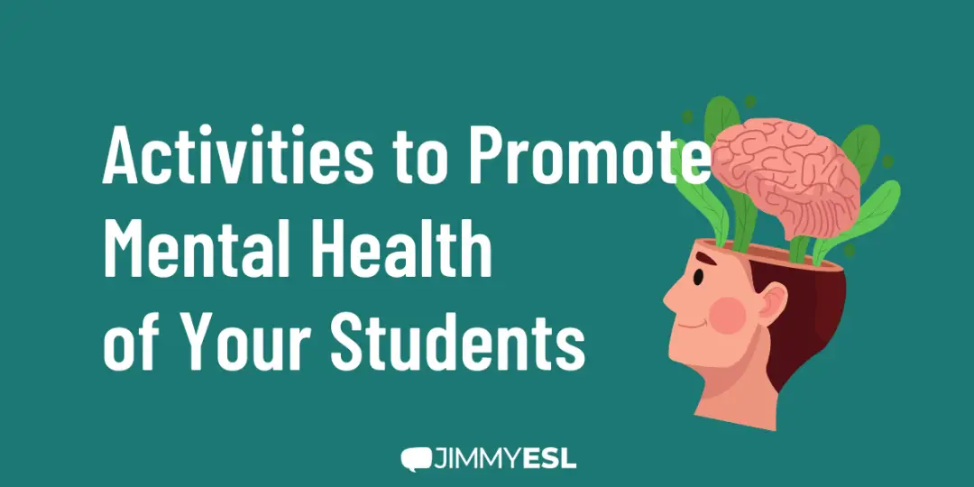
Mental Health Activities for Students: 6 Tips for the Classroom
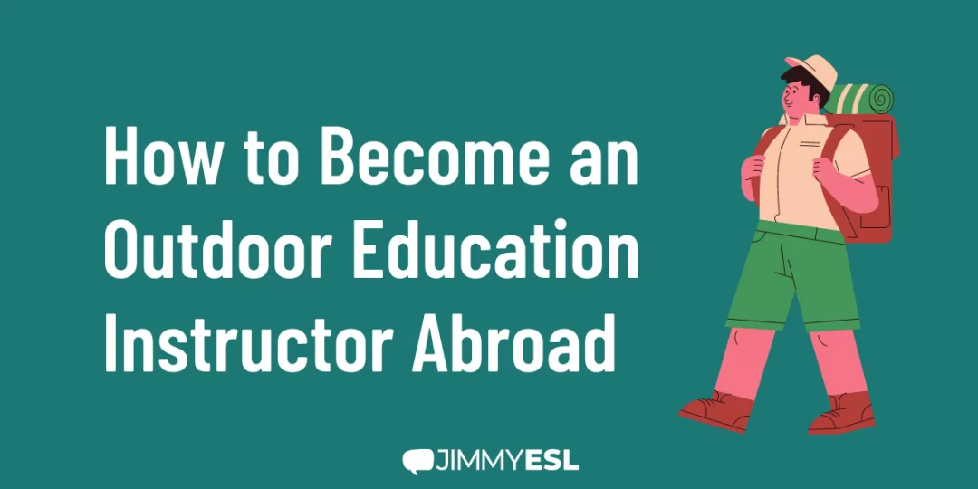
How to Become an Outdoor Education Instructor Abroad

How to Develop Patience as a Teacher? 7 Practical Strategies
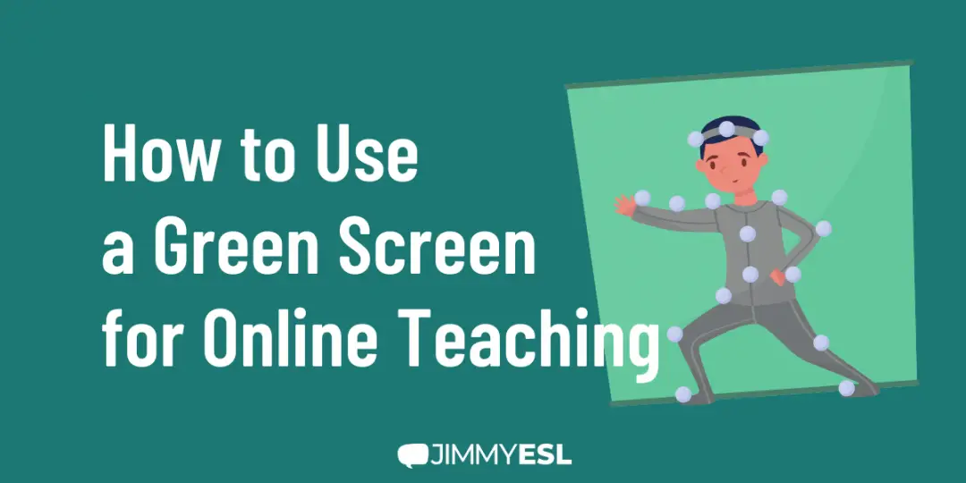
How to Use a Green Screen for Online Teaching (Classroom Background)
Tips for Teaching English Online
Already before schools closed during the pandemic, online English lessons had become increasingly popular. It’s a great opportunity for ESL teachers to make a living working from home or earning an income on the side. In our guides, you’ll learn everything about it, from finding jobs and setting up your workplace to interactive teaching methods.
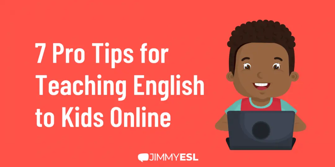
How to Teach English to Kids Online: 7 Pro Tips

12 Companies to Teach English Online to Chinese Students
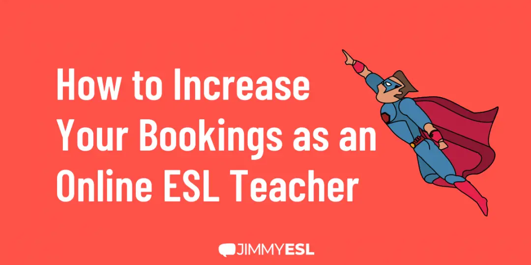
Teaching English Online: 18 Best Practices Guaranteed to Increase Your Bookings
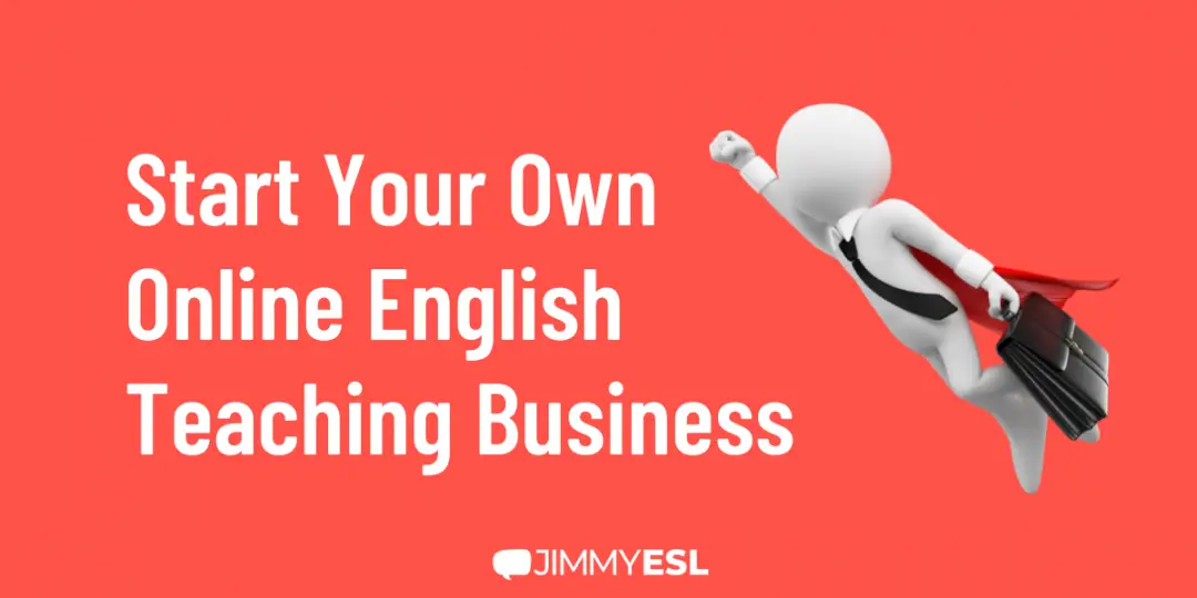
How to Start Your Own Online English Teaching Business
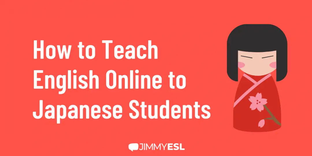
Teaching English Online to Japanese: The 101
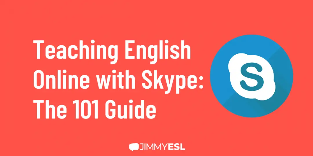
Teaching English Online with Skype: The 101 Guide
Financial tip: As an ESL teacher, you will need to transfer money abroad regularly, and that is costly and often time-consuming. There are simpler solutions for ESL teachers that you could be using. View the currency transfer guide to learn more.
Become an ESL Teacher
Are you considering teaching English as a foreign language – abroad or online?
Usually, getting your TEFL certification is the first big step towards a career as an ESL teacher.
Maybe you are overwhelmed trying to comb through all the resources and options out there.
This website is here to help you understand what the TEFL certification is and what TEFL course options are out there, so you can get the accreditation you need to start teaching English abroad or online.
What is TEFL?
The acronym TEFL stands for Teaching English as a Foreign Language (while TESL refers to Teaching English as a Second Language – both therms basically mean the same thing).
TEFL is one of the world’s fastest-growing educational fields right now, and as such untold numbers of opportunities are cropping up for certified professionals to teach English online and around the world.
Your TEFL Certification gives you a license to teach English as a foreign/second language upon completion of a teaching course, in private schools and training center, or independently as a freelance teacher.
Virtually anyone who is a fluent English speaker can get TEFL certified, and there are many platforms that offer TEFL certification both online and in person.
Starting Your New ESL Teaching Job
Your first few months as an English teacher will probably be a total whirlwind: getting settled, exploring your new city, making friends, and starting a new job at the same time is no joke!
If you feel overwhelmed managing a classroom and moving at the same time, don’t worry: you’re far from alone.
Thankfully, Facebook is full of forums where you can find expat groups and people who’ve been in your shoes, people who can show you how to eat hot pot and where to go to turn in your visa documents.
Once the dust has settled, and you’ve gotten into a rhythm with your classmates and neighborhood grocer, you may be ready to push the envelope and look for more.
Other teachers fall in love with teaching abroad and decide they want to turn what they’ve learned as an ESL teacher into a career. Teaching English online has become greatly popular, and the demand for new and experienced online tutors is sky-high.
There are tons of possibilities out there if you want to do that, and our article about what to do after teaching abroad will help you figure out what options are the most exciting (and feasible) for you.
No matter what you do, you’ll find that teaching ESL abroad opens whole new worlds to you.
Teaching English abroad makes you an international citizen, a person standing at the open gates of the world.
